Austin Public Library- App Proposal
This presentation began as an examination of a service with both digital and physical components. Over the following eight weeks, I would begin researching pain points of other patrons, synthesizing their thoughts and feelings, create solutions for these problems, prototyping a product to address these problems, and testing this product with users. I identified the Austin Public Library, due to it’s use of over 1 million residents, and it’s personal importance to myself.
The Research
The library’s service of loaning books encompasses three main components. The physical space where people check out books and spend time, the digital space where people browse the digital/physical inventory and place holds, and the community space the library offers.
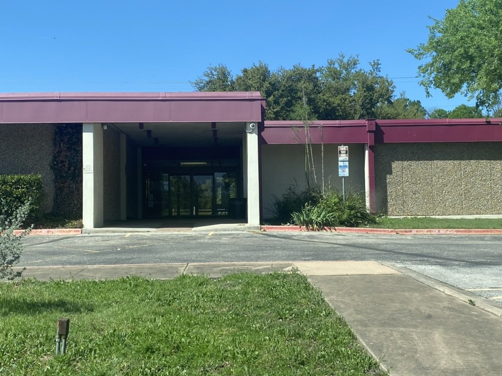
Willie Mae Branch
I chose the Willie Mae Branch and began to interview patrons for a few reasons: it isn’t the main branch and has not received updates in years, it serves a historically low socioeconomic status neighborhood, and it’s my own personal library. I asked patrons questions regarding what they appreciate about their library, what their preferred uses of their library were, and what they would like to be improved about their experiences. I spoke to eight library users and one librarian for a cumulative two hours within the library. I heard the following from the people I interviewed.

“I feel like a library can be a great place for community for socialization for older adults for maybe classes, lectures, information, but they don't do that. And I wish they did.”
-Ron

“The library is not that clean, and there's often this smell...I would stay in there longer probably if it was nicer”
-Haley
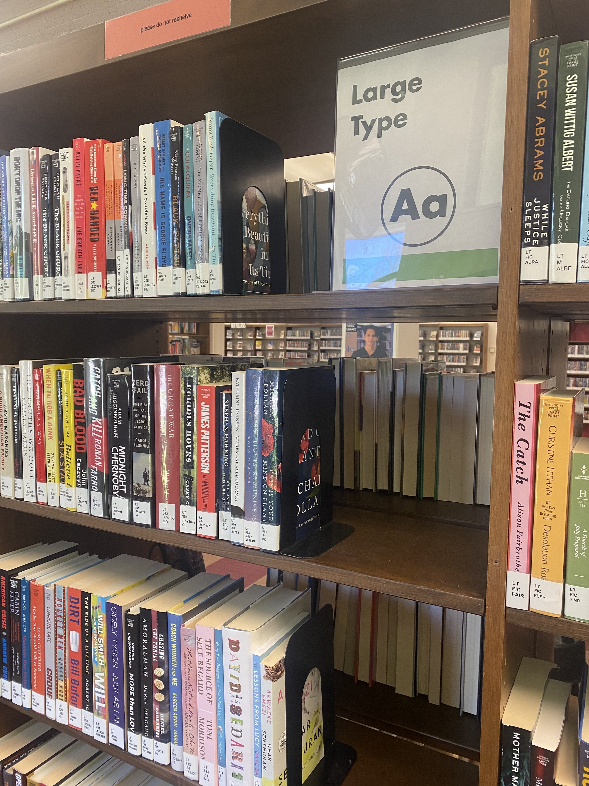
“It's old. It's dingy, and it's not welcoming...it’s got old carpet, old shelves, cramped space, it’s an old building”
-Jenny
From these quotes and others, two clear themes emerged. There is a disconnect between the digital resources and the physical library caused by the sprawl of information over multiple platforms combined with confusing navigation, making digital resources inefficient. People believe using the library as a community space is important, but they’re not using it because it is in disrepair. People felt frustrated that the community services their library could offer, just didn’t seem to be there, and this perpetuated isolating people from their library community.
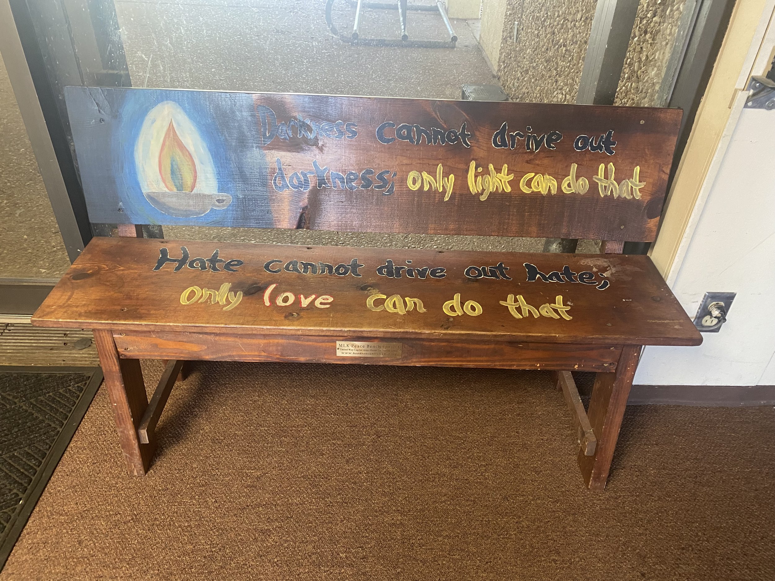
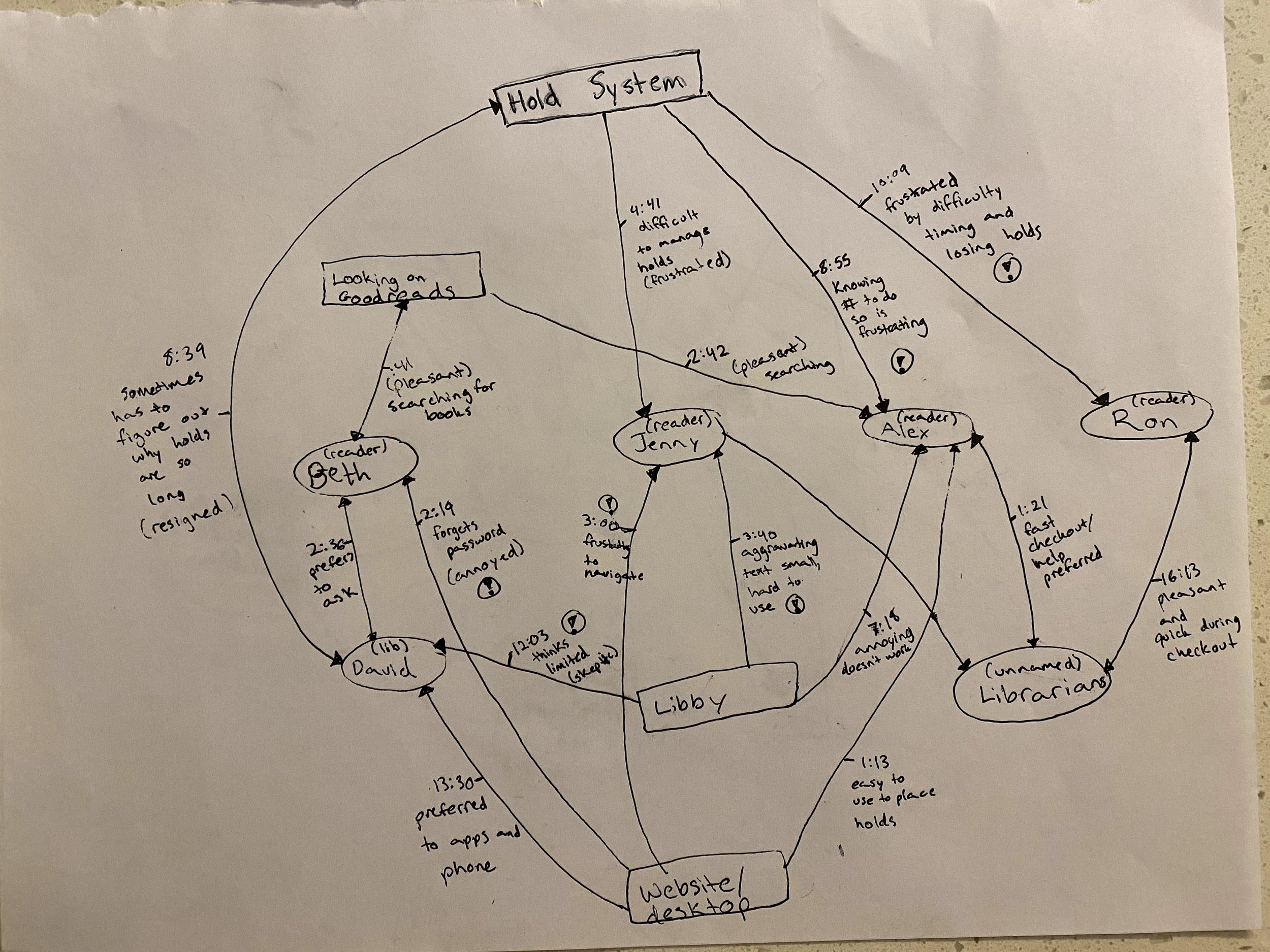
A bench in Willie Mae Branch
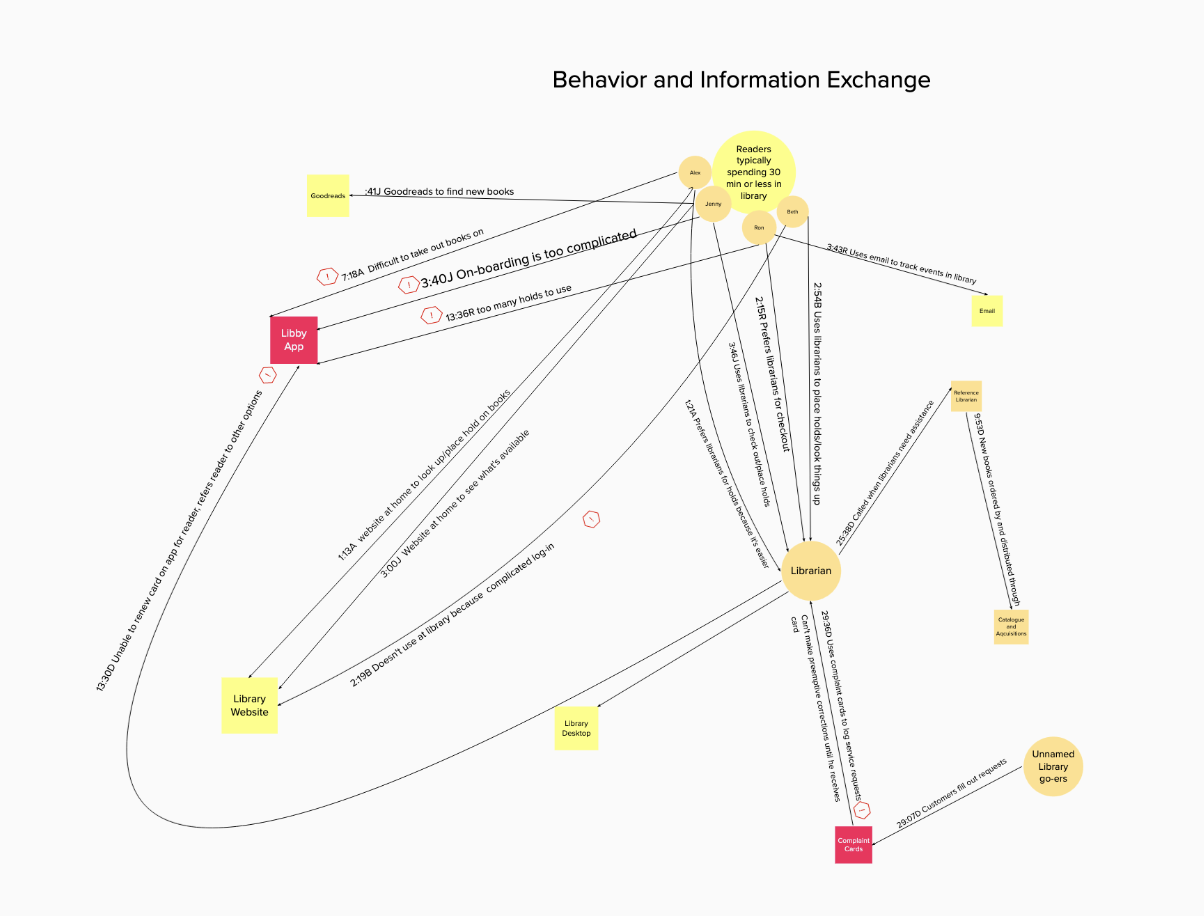
From these interviews, I began to create service slices, to map how, with who, and why patrons were interacting with policies, objects, and people within their library. Another map also showed some emotion within these interactions. Between these maps, I was able to develop a clear idea of where breakdowns within the digital and physical components of this system were. These maps more clearly showed the breakdown in ease of use of digital resources, more specifically the desktop, and the necessity of complaint cards to be filled out for refurbishments to be made to the library.
Synthesis

With all of the utterances sorted and the interactions mapped out between people, objects, and policies, I began to create a journey map out the steps what it takes to check out a book. I chose this activity because it is the main function of the library and there were some difficulties within the patrons’ experiences. The activity was distilled into steps based on the data within the interviews: finding a new book, checking out a book, placing a hold, and picking up the book. These actions served as one axis and a separate emotional axis was created to chart what each interviewee did during these steps and how they felt.

First iteration of a journey map
As the journey map developed, there were three main points in the journey that had clear emotional impact on the users. Users expressed frustration when using the library website, especially when this was completed on the desktop, due to confusing layouts and difficulty logging in. The next pain point was going to the library itself. This is where people voiced disappointment at the lack of community feeling, “dinginess” of the library, and desire for more events. The final point of interest, was an uptick in positive emotions when interacting with the librarians themselves. People felt the librarians were personal, and they were able to provide efficient assistance, than if the interviewees were to attempt a task on their own.

Final Journey Map
I also began to look into what digital resources were currently offered by the library, in comparison to the other digital resources the interviewees were currently using to create a comparative analysis. The comparative analysis helped uncover the gaps in services offered by the library and features that ought to be included as a base offered by other, similar services. The services examined included Kindle, Libby, the library website, and Audible.

Comparative Analysis
It was found that each service had:
Browsing
Social sharing and listing
Personalizing options
Samples
Progress tracking
Ebook/audiobook options
And the library’s digital services included:
Checking availability
Placing holds
Tracking Events
Checking out ebooks/audiobooks
Requesting inter-library loans
Lists
It also was apparent from the interviews, that people only accessed the digital resources for checking availability, and placing holds.
Ideation
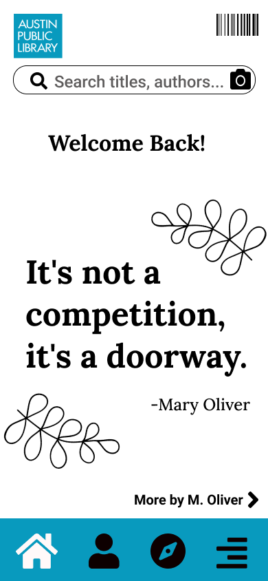
Using the data synthesized for both the digital and physical components of this system, an area of opportunity emerged for a library app focused on creating an easier, mobile experience of digital resources to encourage more freedom and independence while using the library. As I began ideating what this app could look like, I created a value promise to help guide the mission of this product.
Value Promise:
Our goal is to provide a mobile library experience that enhances community, connection, and offers a personalized browsing experience, that’s compatible for both in the shelves or wherever else our readers go.
I began developing what flows on this app would need to do and what a ‘happy path’ toward an ideal state would need to include. The flows that I decided to develop came directly from the pain points my interviewees mentioned. They wanted an easier way to check out and place holds, a way to connect to the community within their library, and to improve their experience of spending time in the library.
Prototyping

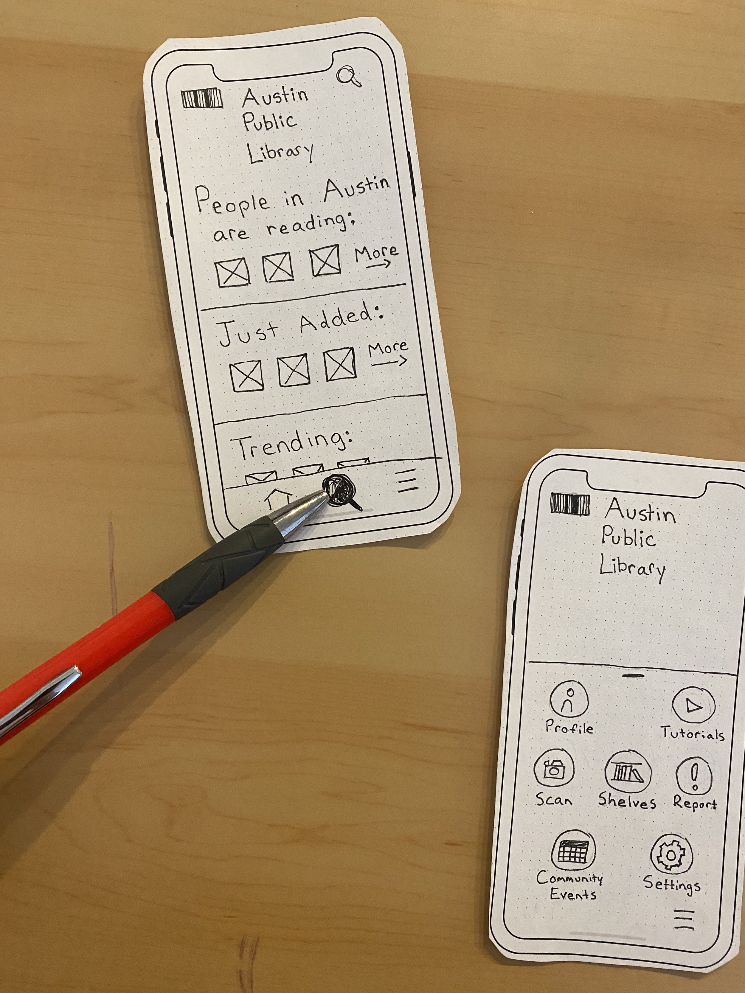
2nd round of paper prototyping
Prototyping occurred in three main phases. The first phases were rough, low fidelity to approximate which features should be included and how for each flow from the ideation phase.
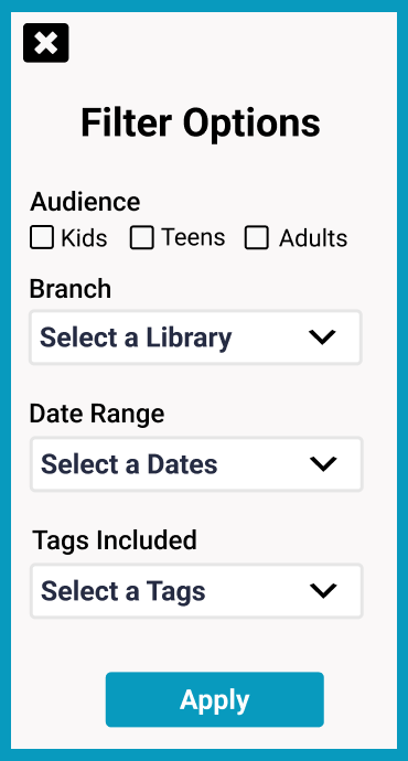
The next step was to refine those initial low-fidelity paper prototypes into high fidelity paper prototypes, for an initial round of usability testing. A moderated usability test was completed with 6 participants using the Search and Check out flow, due to most participants reporting this is a key feature they use across all digital resources. The feedback at this phase was regarding the difficulty people had locating the search bar, and the cluttered appearance of the homepage. This feedback was important and the prototypes were adjusted to accommodate these changes as they were digitally prototyped in Figma.
Digital Prototype
Three prototypes were created to simulate three important tasks that would address pain points mentioned in the interviews.
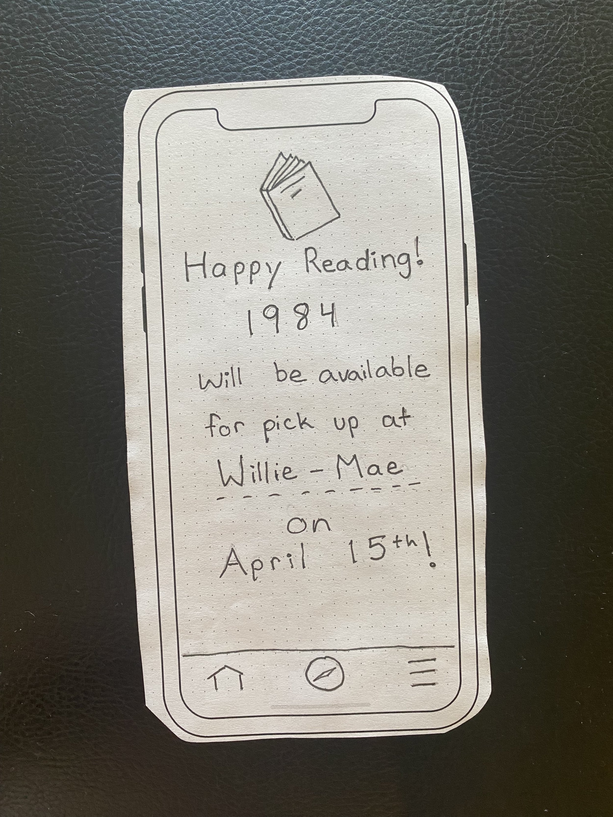
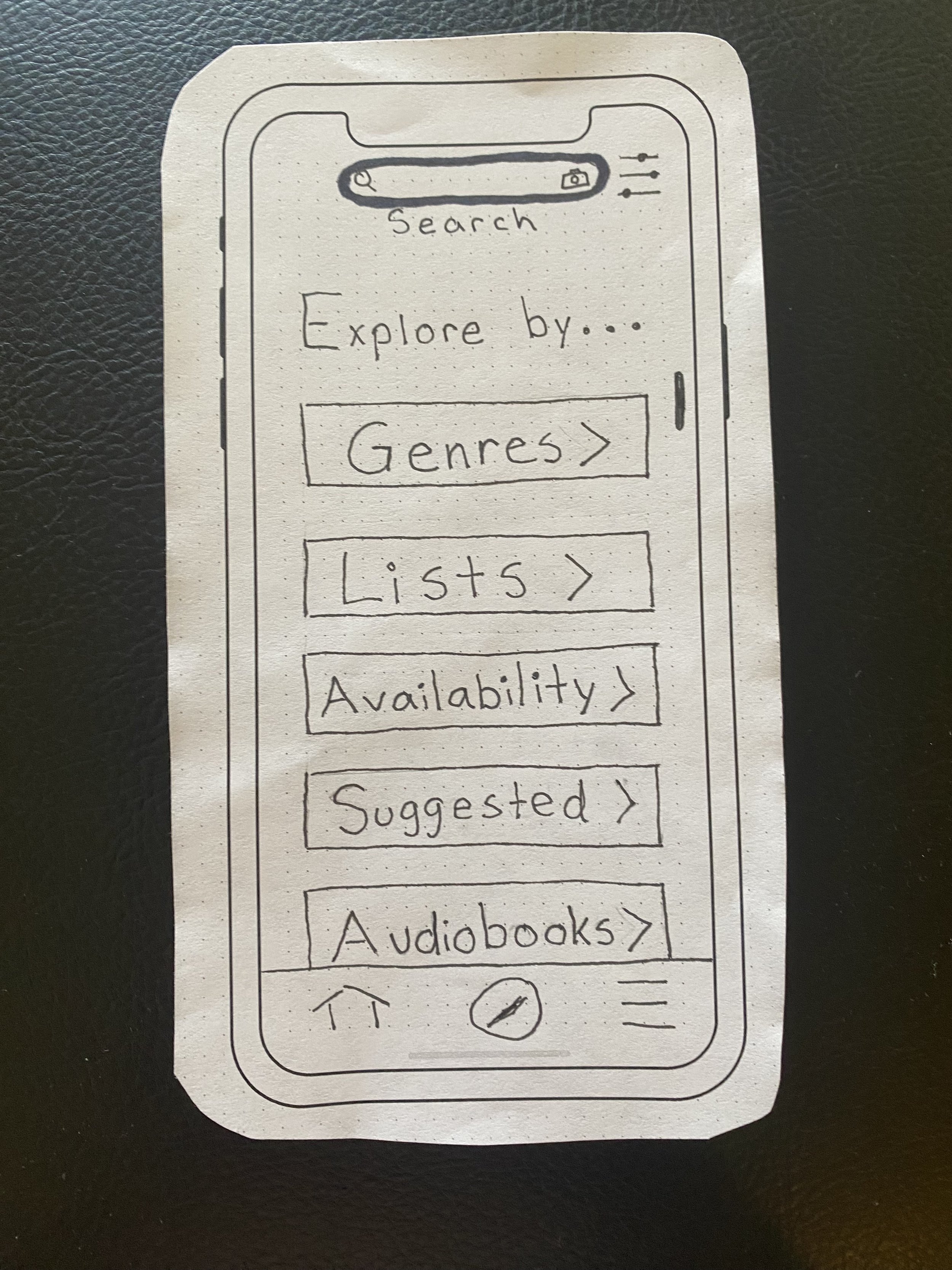
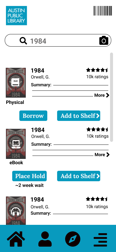
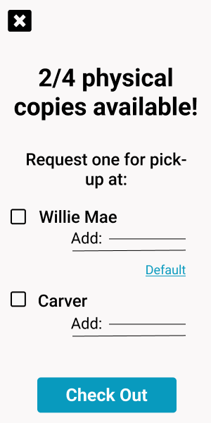
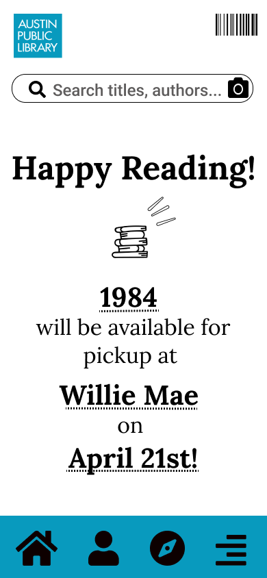
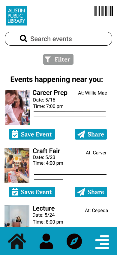
The first of which was searching and checking out a book, as people said this was frustrating to complete within the library, and as the gaps in the comparative analysis demonstrated, could be improved.
Search and Check-out

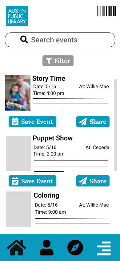
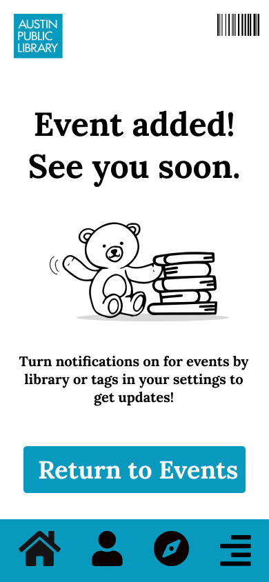
The second prototype created was for searching and saving an event, to address the lack of community interviewees expressed feeling. This flow is supposed to encourage exploring events by interest and location, with the option to share them with other people, facilitating the ease and motivation for the community to use the library as a community space.
Save an Event

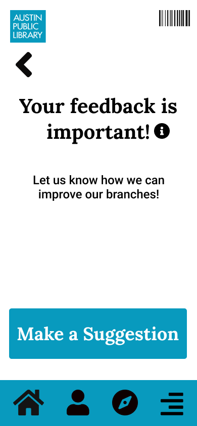
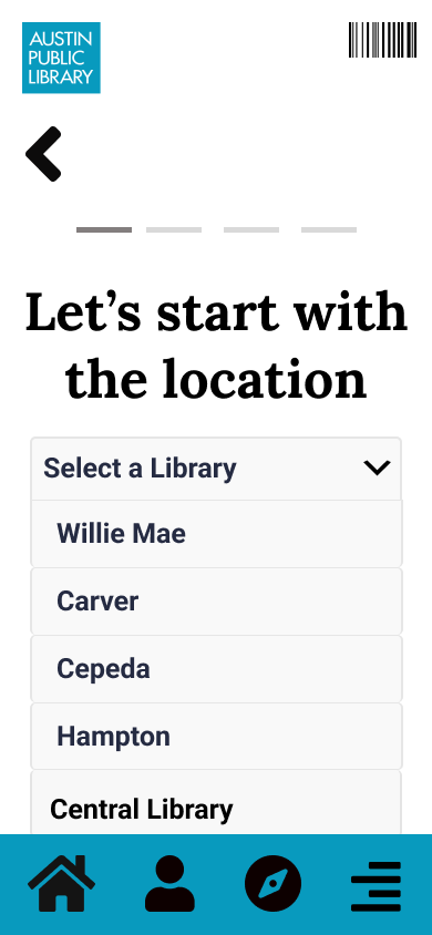
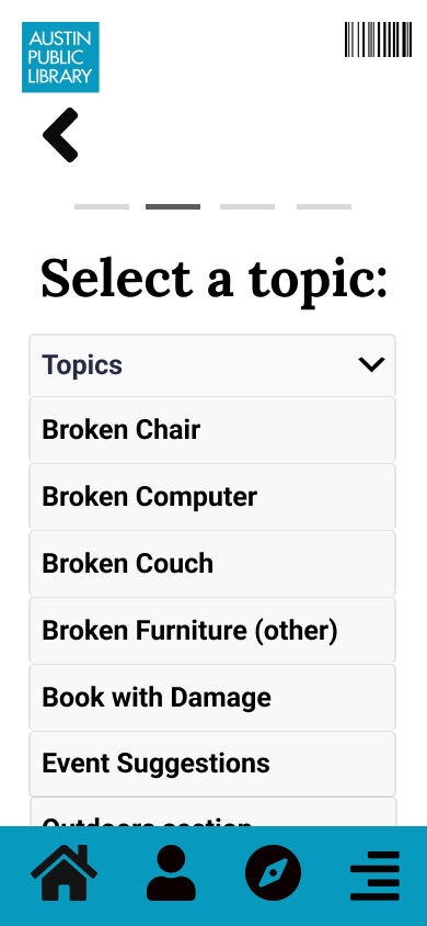
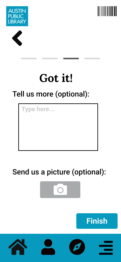
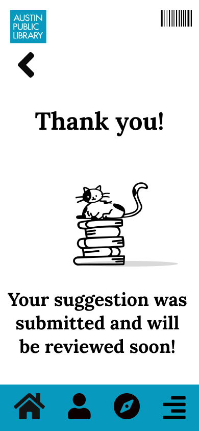
Make A Suggestion
The final flow was created to address the ‘dinginess’ of the library, which many patrons reported. David, the librarian interviewed, explained that for anything to be fixed or refurbished, a customer needs to request and fill out a complaint card with a golf pencil for things to change. He said this is largely the reason the library stays in disrepair.

Complaint Card
“It takes something, a complaint from a customer because we can’t do anything about it until someone does.”
-David
The flow was created to create an easy, efficient method for people to fill out complaints without the discomfort of requesting a card, or filling it out within the constraints of the library.
Testing
Once the digital prototypes were complete, they were uploaded to Maze, to begin unmoderated usability testing. Participants were recruited on an Austin specific internet forum and through secondary contacts, with the recruitment standard of ‘currently uses Austin Public Library’. Participants were given prompts to complete each flow, answer questions regarding ease of use and expected function of each flow, and a poll to discover what was and wasn’t working for each task.

Usability flow map from Maze results
Maze provided maps to show where people diverged from expected paths, and heatmaps to show where people clicked for analysis of each flow.
Search and Check Out Results


The heatmap feature and verbal feedback on this flow suggested several areas for improvements. People felt the medium of each book could be more clearly labeled, the language regarding checking out was unclear, and people were unclear on what could be clicked. These adjustments should be accommodated for in the next iteration of these prototypes to reduce confusion and frustration.
Save an Event Results


The results for this flow suggested participants were unclear on what they could search for, regardless of the text in the search bar. Participants wanted the search bar to extend to the entire app when searching for community events. Participants also expressed confusion with the function of both the discover button, and what was included under the hamburger feature. Participants gave feedback that the library should perhaps have it’s own page, or a grid layout on the homepage to reduce searching. This feedback should be carefully considered and iterated upon in the next version of this prototype.
Suggestion Results

Finally, participants expressed confusion over the language of ‘Suggestion’ and reported they would be unclear on the function of this flow without explanation from the prompt. This adjustment should be accommodated for in the next iteration of these prototypes.
The Future
Vignettes
The next step was to project what the app could look like, following expansion beyond the most viable product. Low-fidelity sketches, called vignettes, were created to show what features could be added or created to improve upon the current emotional state and experience of users. A total of 50 sketches were created initially, with the five ideas being iterated upon at a higher fidelity.

Some of the 50 vignettes
The vignette concept that was most in line with the value promise, was a feature that could be built off the community events page. The feature is a book club page for members to find each other and meet up at libraries hosted by their librarians, both improving the relationships of the community with each other, to their librarian, and with their library as a community space.

Final draft of one of those vignettes
Story Board
A story board was developed using the vignette for book clubs, to demonstrate the impact improving the social features could have, on both the library and it’s community to connect people in the way they feel is missing. The story was created around ‘Anna’ an Austin transplant, who’s desire for a book club mirrored what I heard interviewees reference as a point of interest in building the community they desired.

Anna is a young, Austin transplant and often uses her community library to check out books. She would like to connect more with her newfound community there, but she doesn’t feel like her library offers her many reasons to stay besides picking up her books.

This makes Anna feel isolated. Other patrons don’t spend a lot of time either because her library is in disrepair; not enough people stay long enough to fill out complaint cards, so the library is not fixed.

While browsing her library app, she notices a community events page, and sees available book clubs by genre, locations, and times and she is happy to join one that fits her schedule and love of Sci-fi.

The book club home page displays pictures of members of the club and the book of the month. She is able to meet other people in the safety of her local library and bond over a shared love of books. She has fun and forms new connections to both her community and library.

As Anna and others go to book clubs every month they create a stronger community bond, feel happier with their new friendships, explore more library content. They are also able to improve their library by filling out complaint cards as they use it. The library looks great and feels more welcoming for the community.
What can we do to help people like Anna now?
To get this app out to the community, there are a few, immediate steps that could be taken. The first is to adjust prototypes and re-test them to gauge whether the improvements based on the initial test were effective in improving clarity and ease of use. The next step would be to begin training librarians in use, to ensure a smooth roll out for the public; I learned in my interviews that people will always ask the librarians for assistance, and they would be integral to a successful roll out. Another step would be to promote use of app to the community it’s meant to serve to start connecting people in their community through a shared love of books. Stories are meant to be shared among friends, and it’s important our library is home to both: stories and friends.
