Redesigning the Barton Springs Mobile App
The following post explains the process of redesigning ATXswims, the mobile application for purchasing tickets for going to Barton Springs.
For this project, I was prompted to choose a service that involved a digital touchpoint and evaluate it to identify pain points that people experience, with the goal of creating solutions to address these pain points. This project spanned a total of 8 weeks.
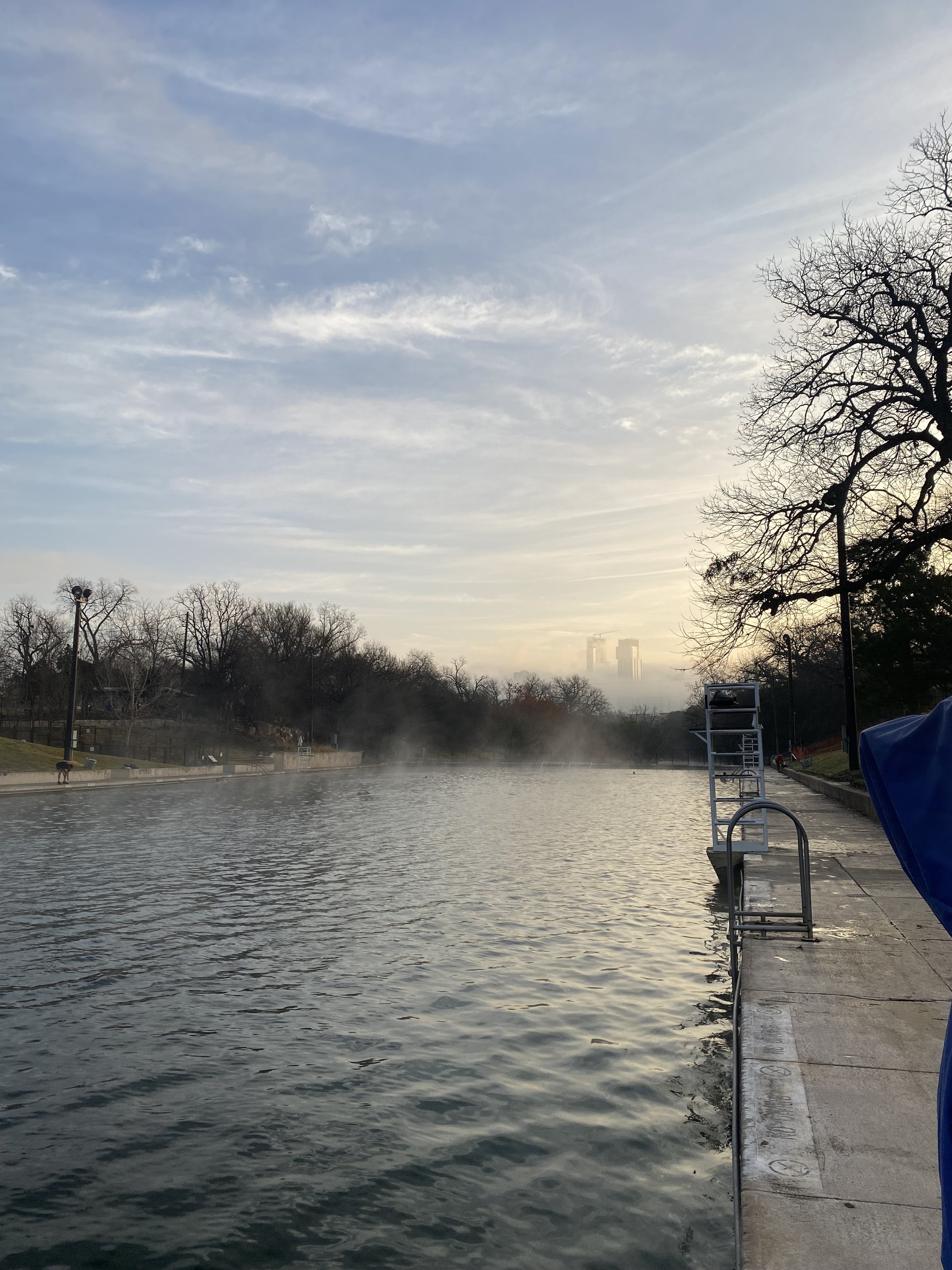
I chose to explore Barton Springs, a well-loved destination in Austin with multiple digital touch points. As someone who has visited Barton Springs many times, I thought it would be interesting to explore the ticket-buying experience for visitors, which can be frustrating, especially on busy days.

Barton Springs Pool in Austin, TX
Our Process

Background
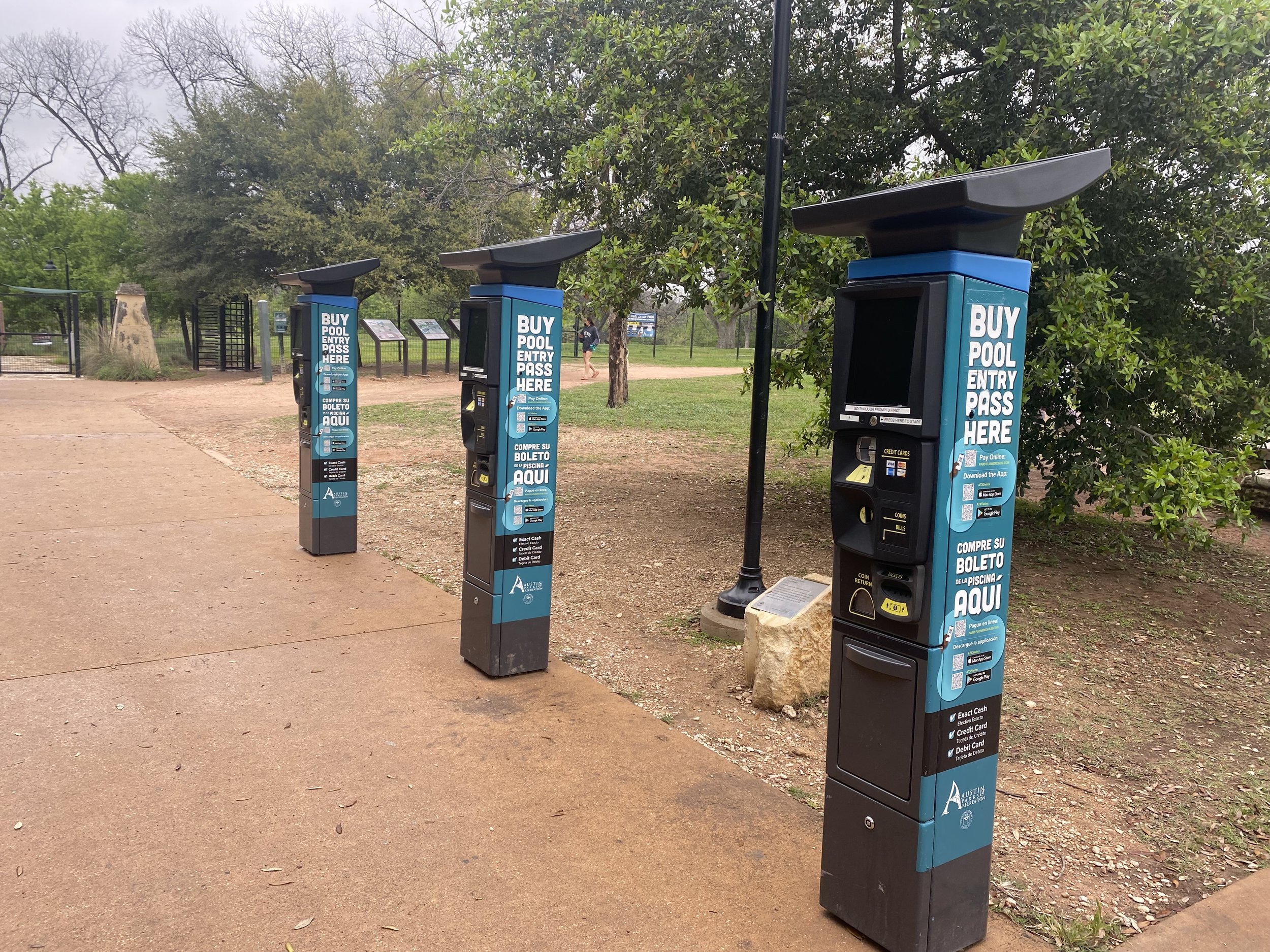
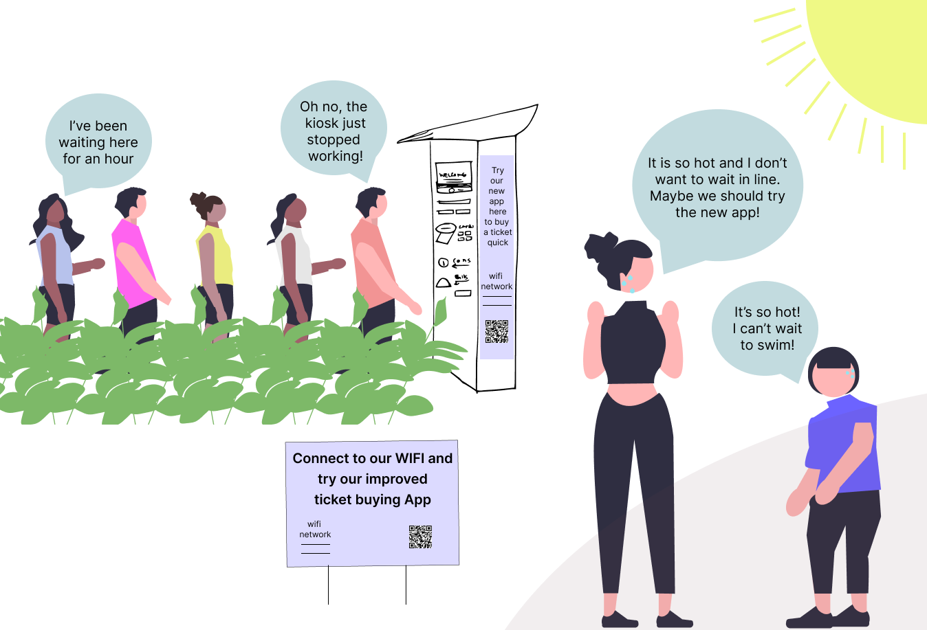
When people visit Barton Springs they will purchase a day pass in one of 3 ways. Using the kiosk, mobile app or webpage.
The ticket buying kiosks (which is a redesigned parking meter) often break down during hours and will take credit card or exact cash.
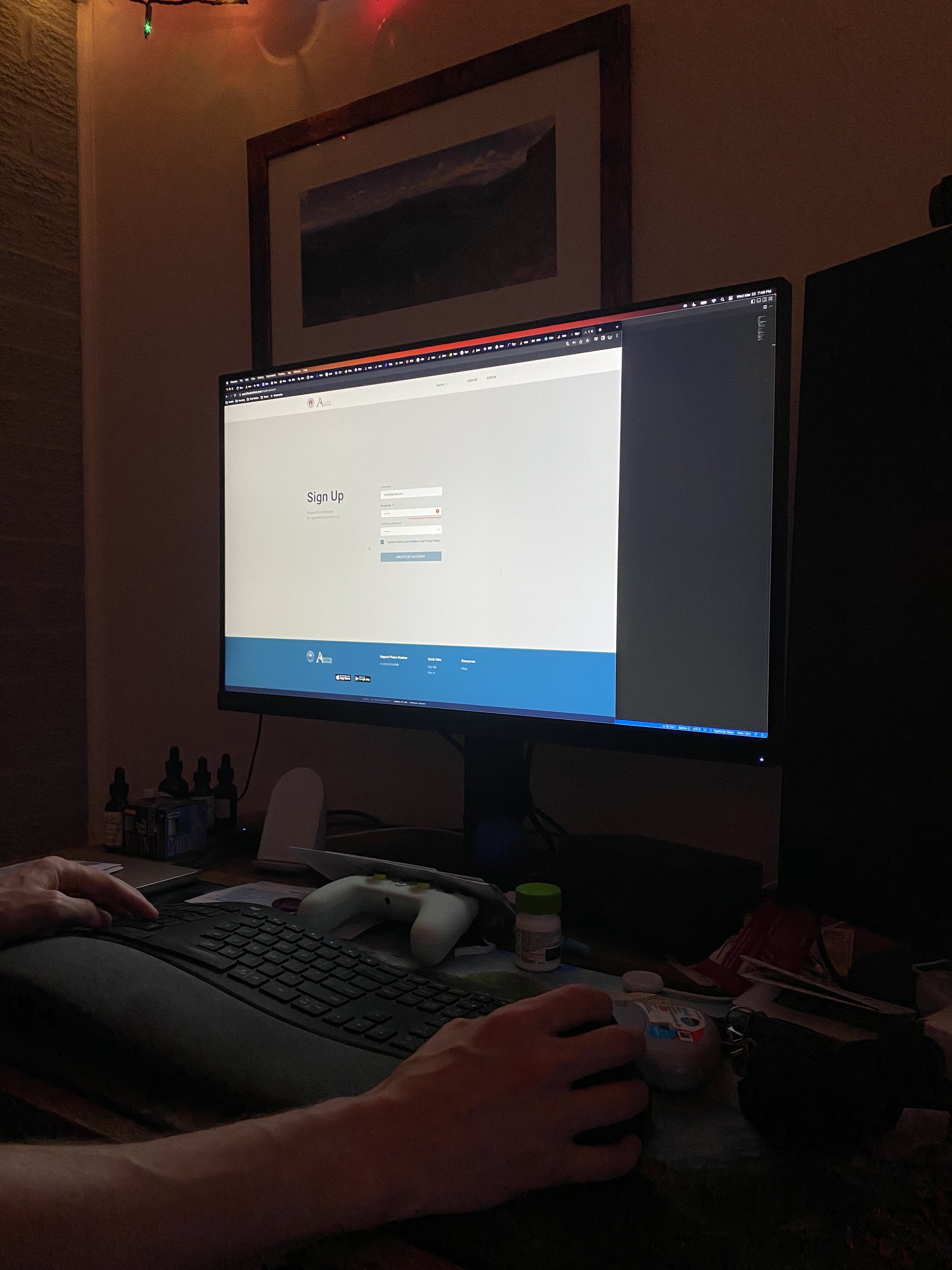
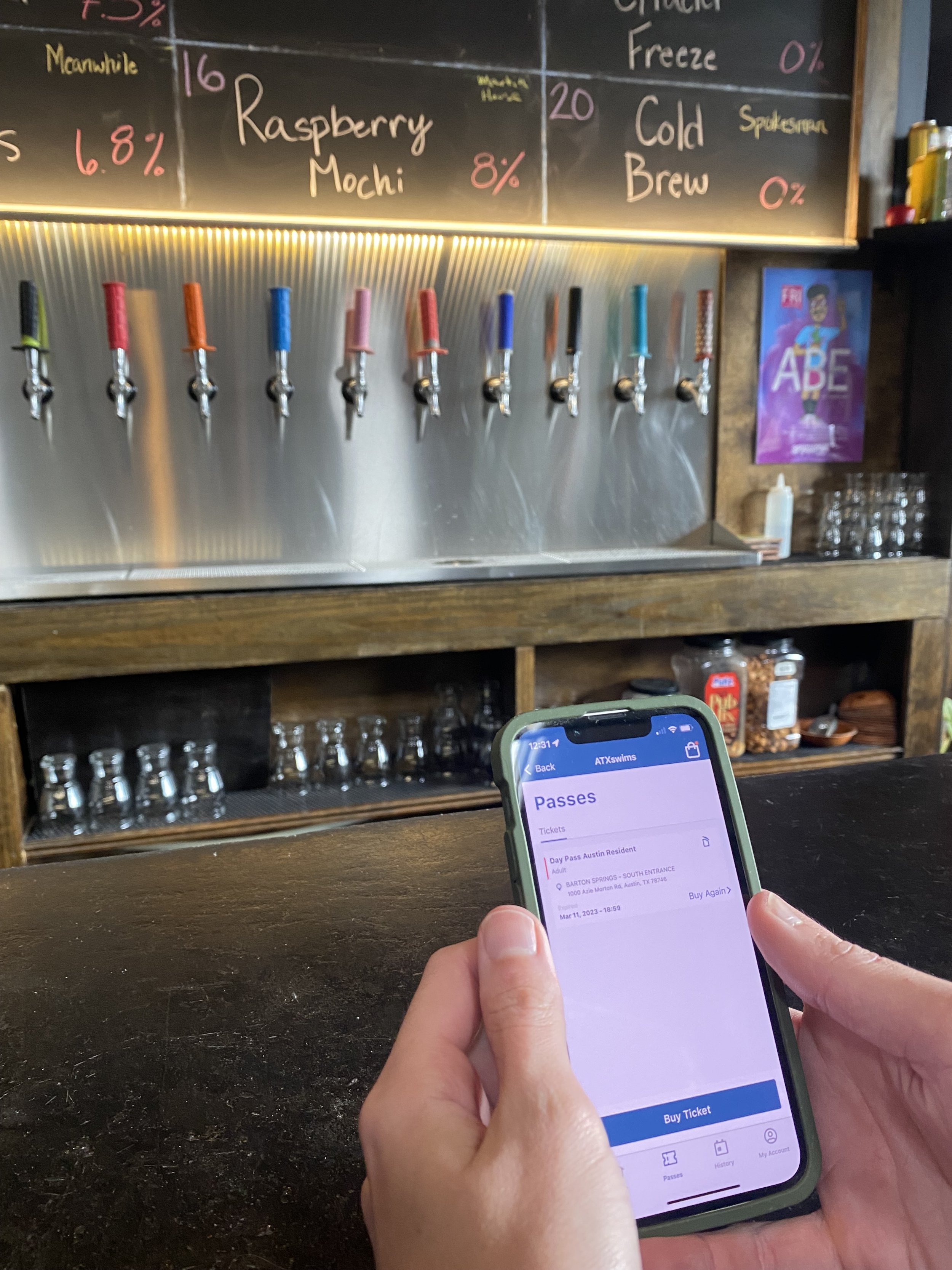
The mobile app was released in 2021 and people still tend to prefer the kiosks, due to the app being tedious and frustrating to use, with many steps and no guest checkout.
The webpage functions similarly to the mobile app, but can only be accessed from a desktop.
Research
I began by creating a research plan to focus my efforts.
Focus Statement: Barton Springs is a well loved establishment for locals and tourists alike, however, people have issues using the payment system which prevents people from enjoying their experience. What problems are people facing when trying to go to Barton Springs?
Objectives:
What issues are people facing when wanting to go to Barton Springs?
How do people experience the payment systems?
Do people feel informed about the experience that they will be having?
Interviews
To learn more about the issue, I interviewed the manager of Barton Springs and six locals from Austin about their experiences when visiting the pool. I wanted to hear about any issues they faced while visiting or working at Barton Springs, especially related to the payment system.
During the interviews, people shared how much the pool meant to them…

“I love working here. This is one of my favorite places in Austin.... If it wasn't for this pool, I wouldn't be in Austin.”
-Barton Springs Manager
“It’s like nothing else.. I can't even describe how good it is to people who haven't been to Austin... It's the entire environment... where people come together and you can see the city. It's just lovely.”
-Adam, an Austin local of 10 years
They also shared about their frustrations with the payment system at Barton Springs…

“I tried to go to Barton Springs last weekend, but there was a massive line for the Kiosk and the app was taking so long to use. I ended up just going home”
-Larry, Austin Local of 2 years

“In the amount of time it takes to create an account, I probably would have just put this down and tried to get the kiosks to work again.”
-Justin, Austin local of 5 years

“I occasionally purchase tickets for Barton for friends that don't have the app set up... the initial ticket buying process is tedious so I end up buying passes for friends because I already use it.”
-Nancy, Season ticket holder for Barton Springs

“I've actually applied for a new job as of two days ago, because as we're coming into the busy season, part of me, doesn't want to deal with [payment related issues] for another season.”
-Barton Springs Manager
During the research process, I discovered why people prefer using the kiosks over the mobile application. People dislike having to create an account and the mobile app does not offer a guest option. Although people generally tried the mobile experience, they abandoned it because it took too long to use. Additionally, the payment process at Barton Springs poses significant challenges for the staff, especially during busier periods.
Synthesis
Service Slices
After conducting interviews, I examined the system as a whole by creating service slices. Service slices provide a way to analyze interactions (between people, policies, technology, objects, etc.) within the system to identify where breakdowns are occurring.
I created one service slice to show the behaviors and information exchange within Barton Springs, and another to show people's emotions and feelings during the process.
Progress Photos for Service Slices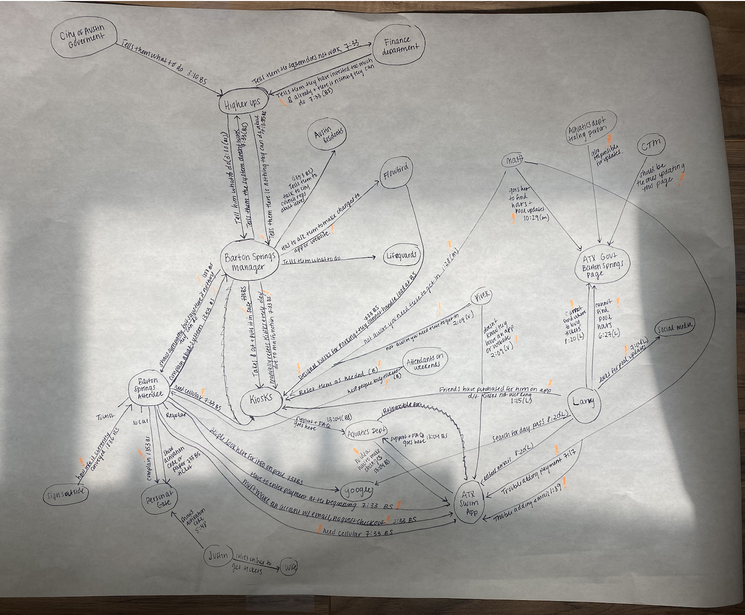
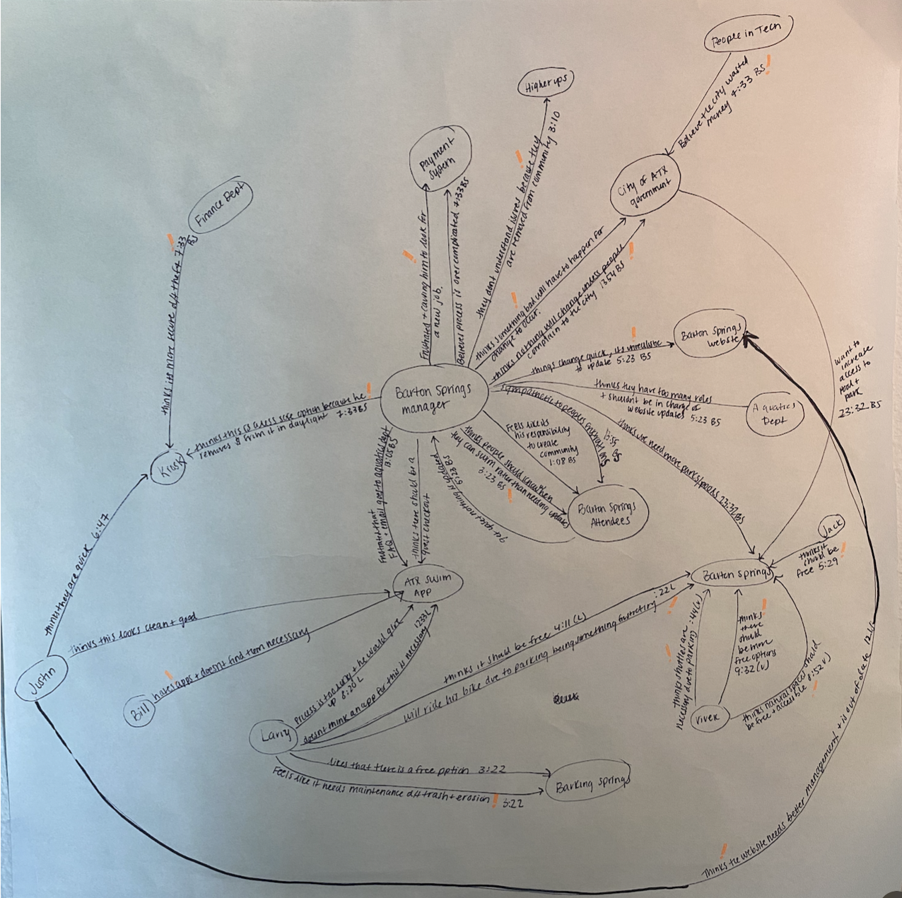
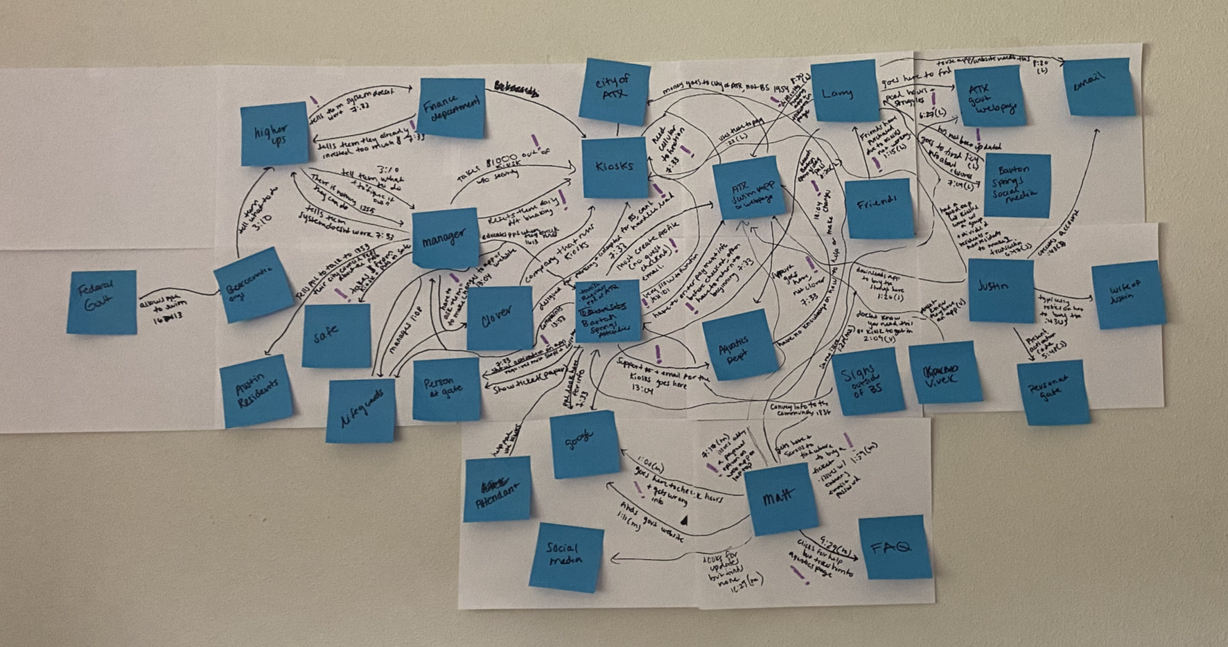
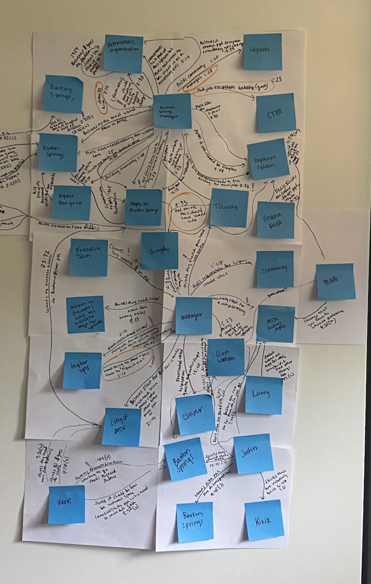
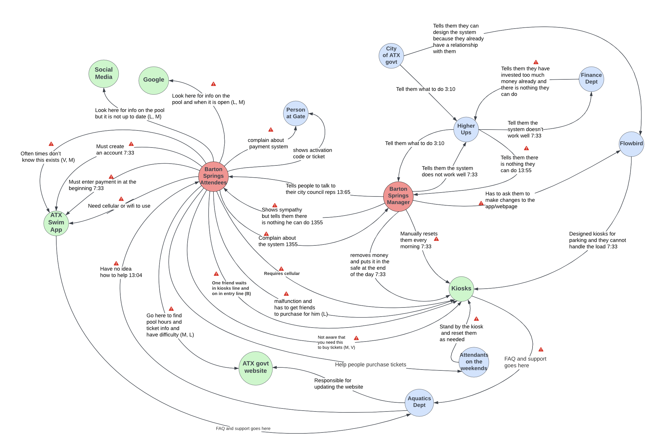
Behavior and Information Exchange

Power, Policy, Information Exchange and Emotion
This process clearly demonstrated how much the payment system affects the job satisfaction of people working at Barton Springs. It also helped me understand why the problem persists despite there being clear issues. Although managers would tell those in charge that the current system isn't working, people in power were resistant to making changes because of longstanding contracts and relationships. As a result, the people working at the pool were the ones suffering.
After analyzing the service slices, I wanted to gain a deeper understanding of users' experiences when purchasing a day pass for Barton Springs. This informed by decision to create a journey map to uncover the nuances and identify opportunities as we move towards ideation.
Journey Map
Journey mapping helped me further understand and visualize the steps and emotions users going through the process of purchasing a ticket. The experience was broken down into individual touch points, the users actions were mapped out and their thoughts, feelings and emotions were identified at each stage. The resulting map helped me identify pain points and areas of opportunity for design changes within the process.
Progress Photos for Journey Maps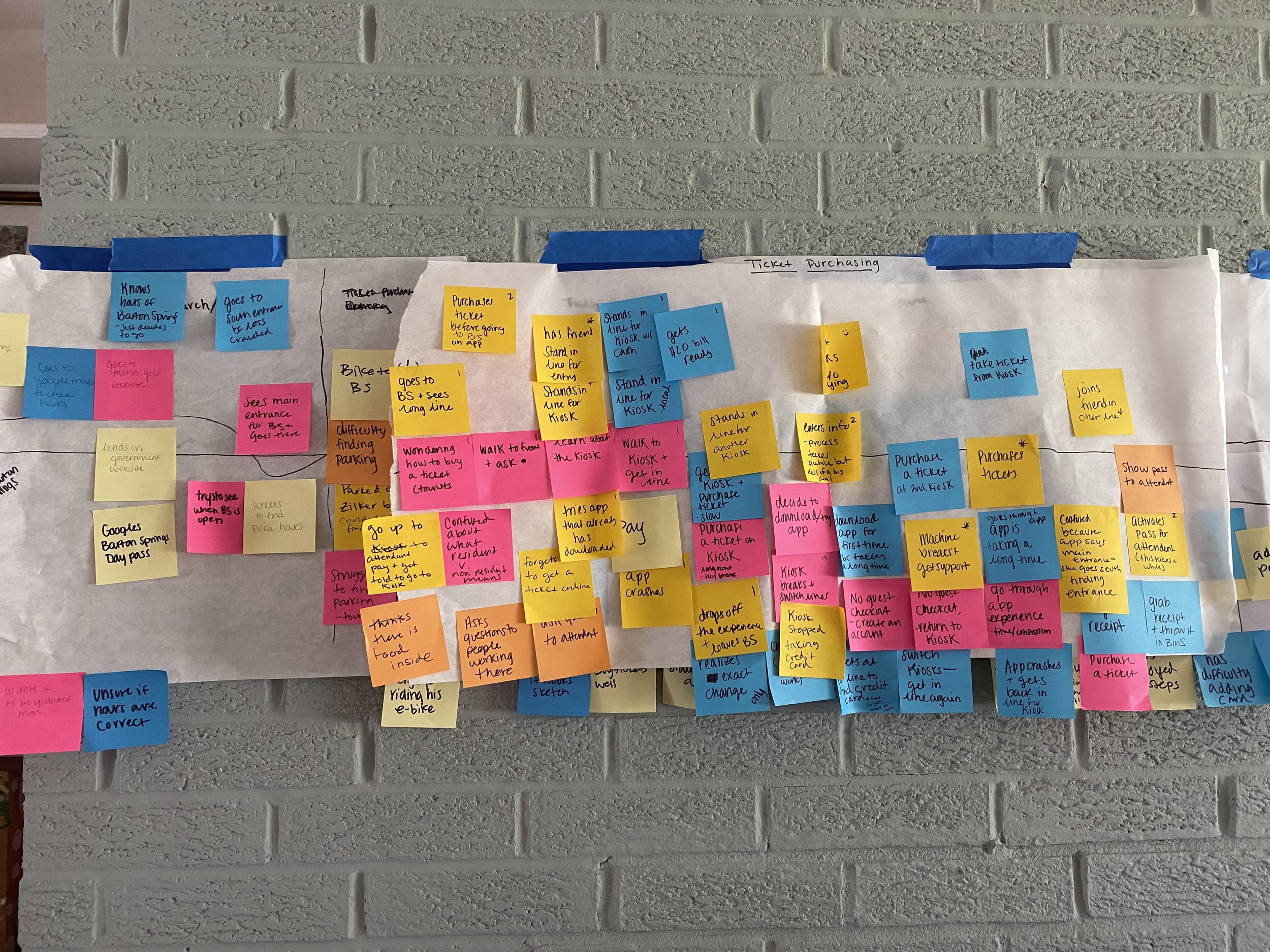
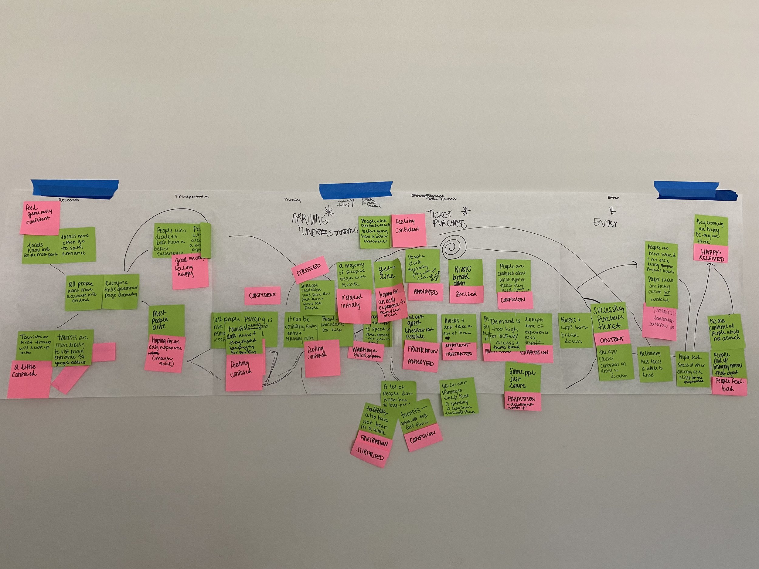

Final Journey Map

Our Opportunity Area: The mobile application
The journey map helped me identify the mobile application as a place with design opportunities to improve the service, with the goal of redesigning it for clearer user flow and fewer steps to purchase a ticket. I decided to target locals, as they are more likely to use the app multiple times, whereas tourists are more likely to use the kiosks only once.
The Problem
Buying a ticket for Barton Springs through the mobile app is a frustrating and tedious process, with no shortcuts available. As a result, many people feel defeated and end up abandoning the process.
Ideation
Value Proposition
To ensure that the final design aligns with the problem identified and people's needs, I created a value proposition:
We are committed to providing a hassle-free visit to Barton Springs. To achieve this, we strive to create a streamlined and seamless ticket-buying process, allowing visitors to focus on what matters most: enjoying this beautiful natural wonder.
Vignettes
I then created 50 vignettes to illustrate an idea that would support the problem that I was trying to solve. In this stage, I was trying to get as many ideas as possible down on paper.

Next, I ranked this vignettes on a grid (easy to use vs. difficult to use, great experience vs. frustrating experience) to see which ones aligned most with our value promise.

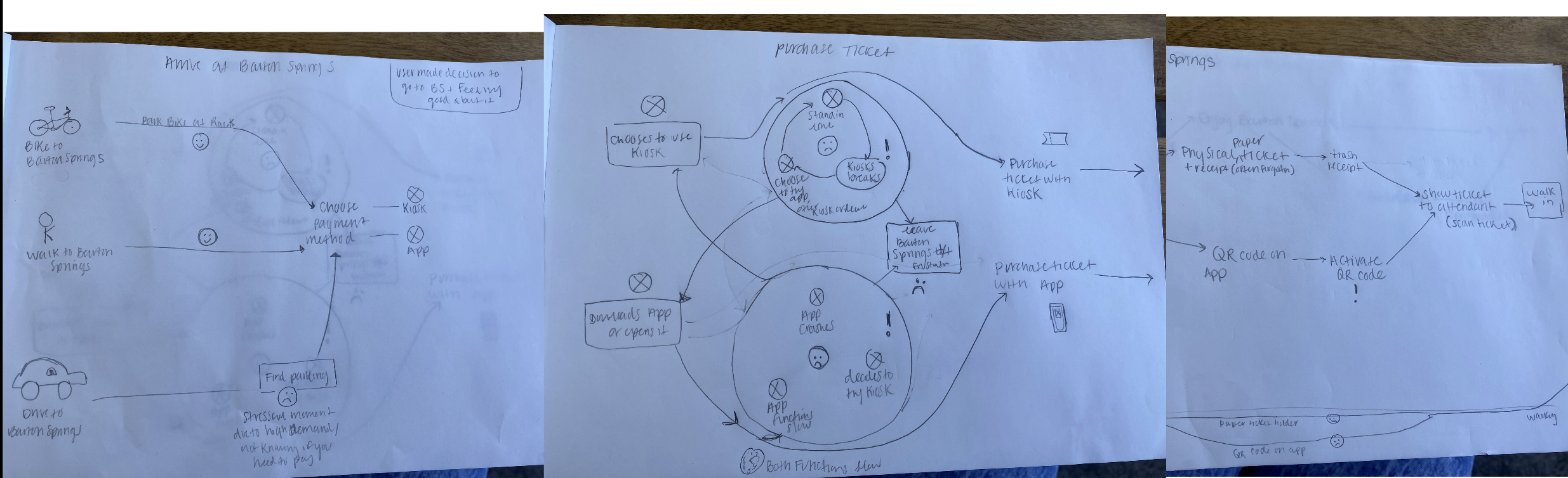
Storyboard & Scenarios
I then chose 5 vignettes to create a storyboard to envision an ideal future state with our proposed solutions. I began by drawing storyboards on paper a few times, before digitizing them.
Simultaneously, I wrote scenarios to go along with our storyboards. These gave the listener context, identified the problem and the idea, and described the use and outcome.

Storyboard: First Iteration
Digitized Storyboard

Prototyping, Testing & Iteration
Competitive/Comparative Analysis
Before prototyping, I analyzed the current application to understand what was missing and where I saw opportunities for improvements. Some of our major findings were:
There was no guest login
The payment process only allowed credit card
The process was repetitive and included unnecessary steps
Ex: They make you choose what entrance you want to buy a ticket at when in reality that doesn’t matter
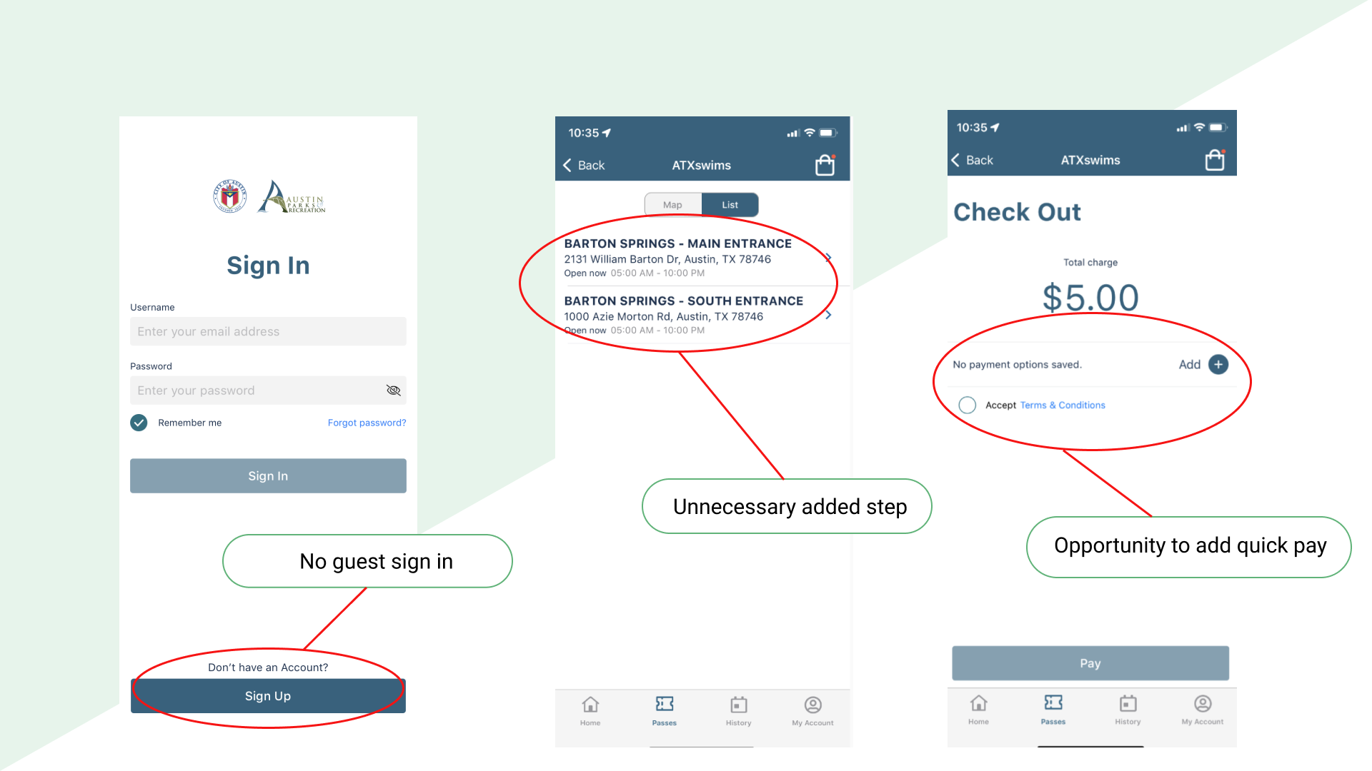
Current ATXswims mobile app
I then looked at other mobile applications for inspiration, focusing on public transit applications, but also looked at Amazons “buy now” feature, as inspiration for offering a quick buy option for the revised ticket buying app.

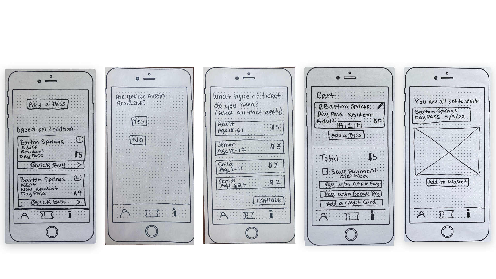
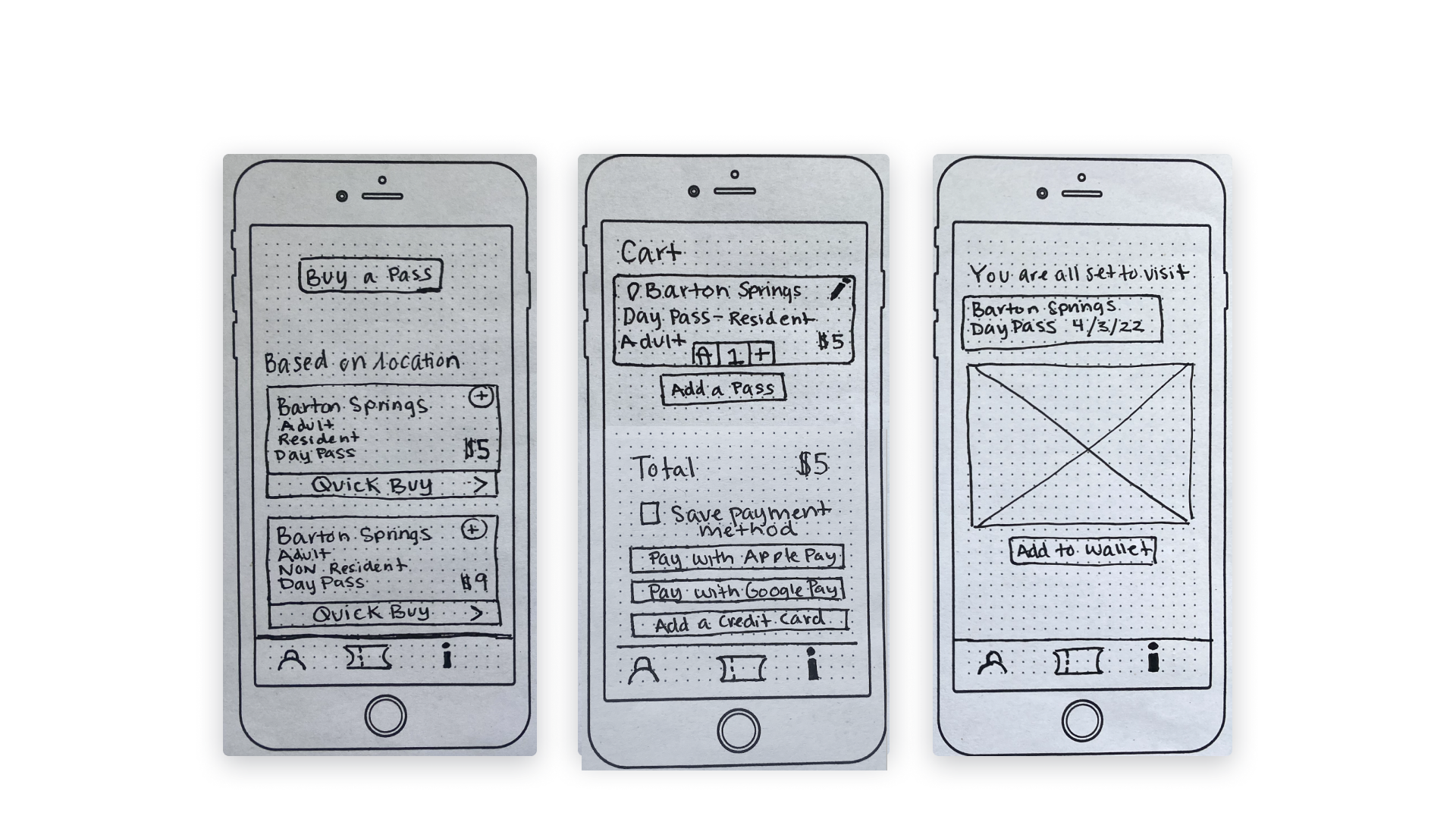
Low-Fidelity Paper Prototypes
The first prototypes was a low-fidelity paper prototype that I intended to use for a moderated usability study.
Moderated Usability Study
I tested the low-fidelity prototype with 6 Austin locals who have visited Barton Springs pool. The tester was prompted to purchase a ticket given the choice of two different purchasing flows (a more detailed purchasing flow and a quick buy purchasing flow). Each test took approximately 15-20 minutes.
This is a little bit of what we heard from our testers:

“I would probably opt for the quick flow. But if I was with my family or with somebody else, I would probably select [the longer flow].”
-Chris, Austin local of 1 year

“I would want to be able to choose different types of tickets and the quantity of tickets that I want on one page, so i can do it all at once.”
-Sarah, Austin local of 10 years
Our overall findings from the usability study were:
The “buy a pass” button was often missed and the function was unclear.
The ‘based on location’ title didn’t convey the intent clearly.
People felt displaying “Barton Springs” on the ticket was unnecessary, when the differentiating factor was the ticket type.
People want easier ways to purchase different types of tickets.
The "add a pass" button on the checkout screen was interpreted in different ways
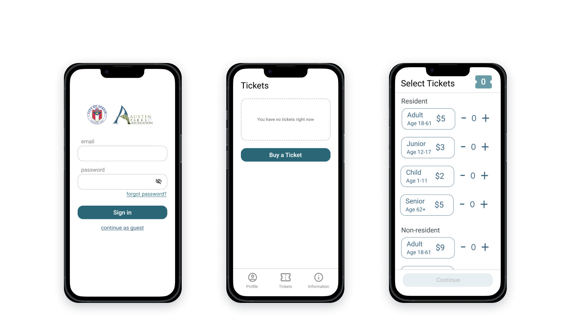
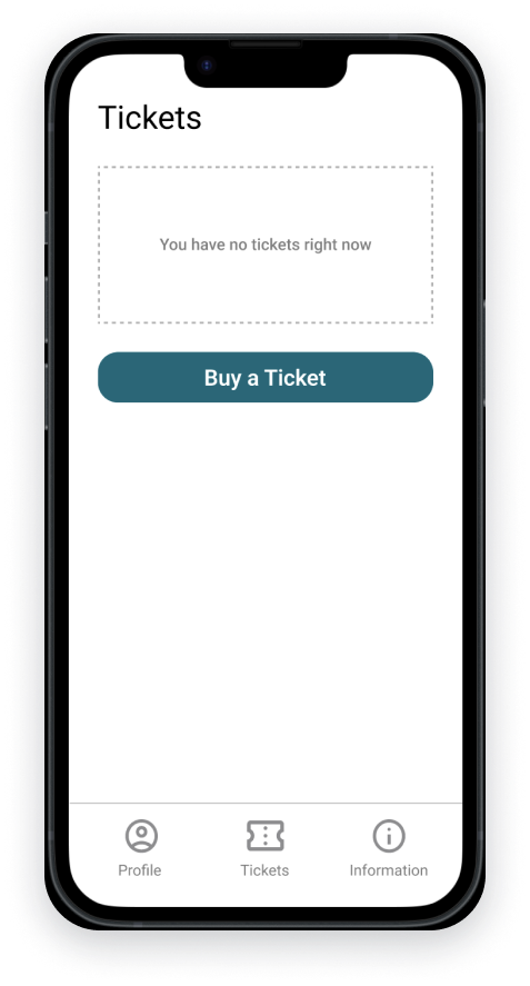
High-Fidelity Prototype
With the insights from the moderated usability study, I iterated and digitized the prototype.
Unmoderated Usability Study
I tested our high-fidelity prototype with 27 people (Austin locals and tourists) with an unmoderated usability study on Maze. The tester was given two tasks, purchasing a ticket with the “standard purchasing flow” as well as the “quick buy flow”.
The overall findings from this usability study were:
The guest checkout option should be more prominent.
Users want more sign in options (faceID, google, apple, fingerprint).
Too many features looked like buttons.
People want more information about the ticket.
People wanted the quick buy page to be simpler.
People liked the design overall.
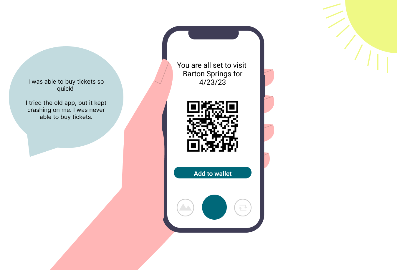
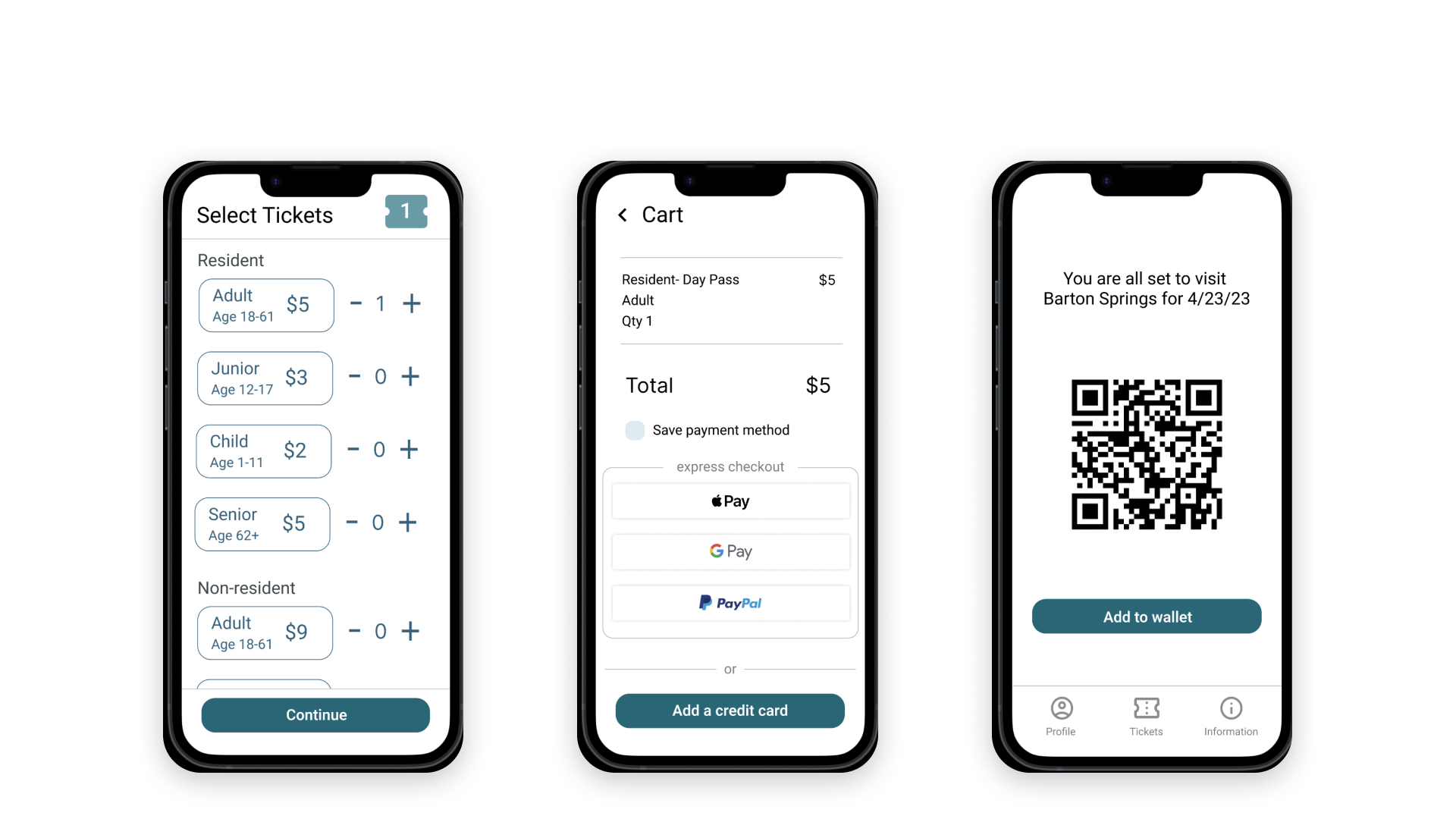
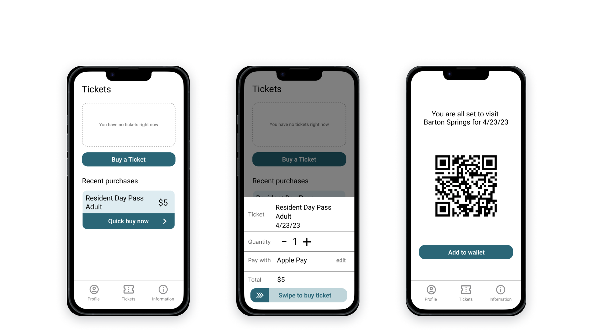
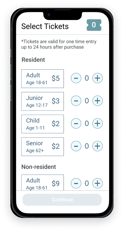
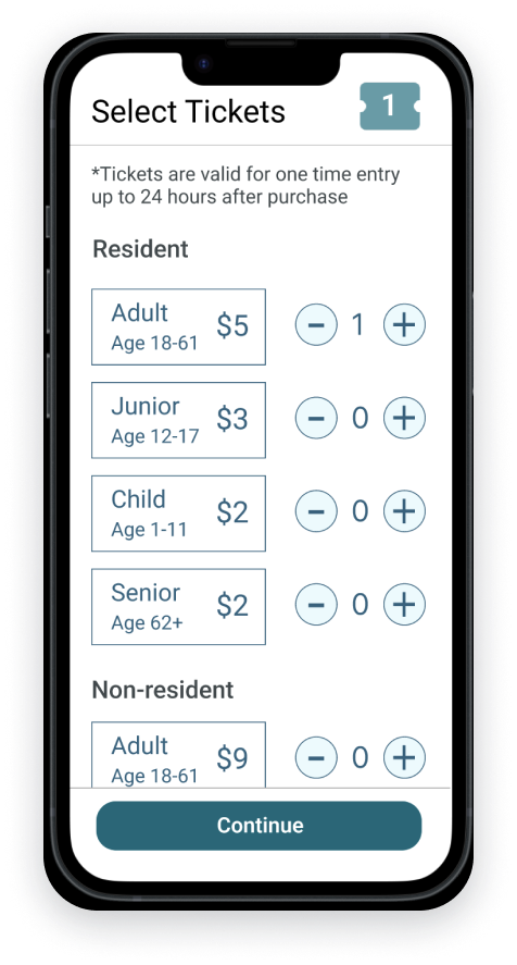
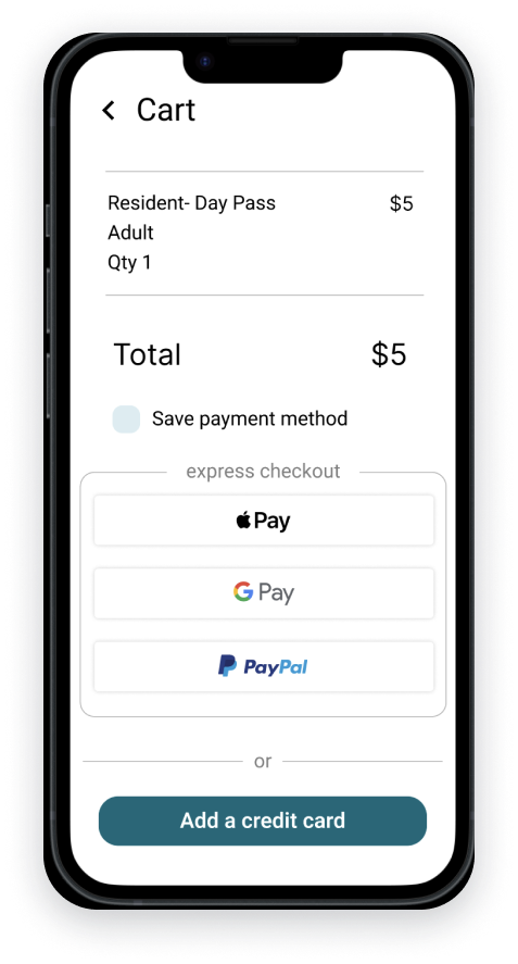
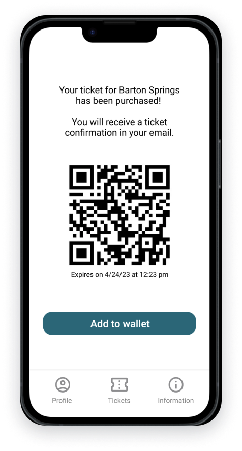
Revised Prototype
The most recent version of the prototype was iterated on with the feedback from the unmoderated usability study.
Purchasing Flow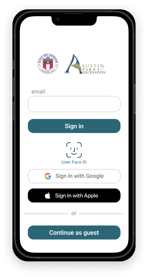
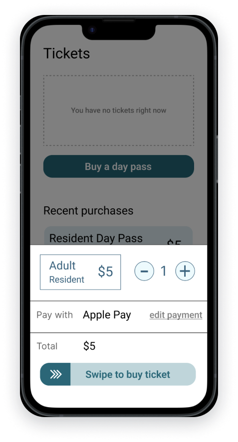
Quick Buy Flow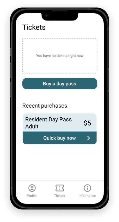

Conclusion
Next Steps
If we were moving forward with this design, my next steps would be:
Discuss the design with the engineering team to ensure achievability.
Continue user testing and iterate on the design as necessary.
Develop incentives and strategies to promote usage of the mobile application over the kiosk.
Explore additional feature requests, such as purchasing a season pass.
Reflections
Throughout this project, I have learned valuable lessons that I intend to apply to my design process in the future:
Make sure to perform research and observation during the times where you will see the most problems exposed. I wish I had realized earlier to do my research at the busiest times at Barton Springs.
Only include in designs what you are wanting feedback on, the level of fidelity will match the feedback that you are getting back. This goes for the presentation of findings to stakeholders as well as testing the prototypes with users.
Your assumptions of what people will want can sometimes be very off, user testing and feedback on the design will ensure that we don’t create something that people don’t find helpful.
And then for simple design choices, ensure non-buttons don’t look clickable.
I hope this insight into the redesign process has been informative and enjoyable. I thoroughly enjoyed working on this project and would love to work on more projects that improve people's access to and enjoyment of public outdoor spaces.